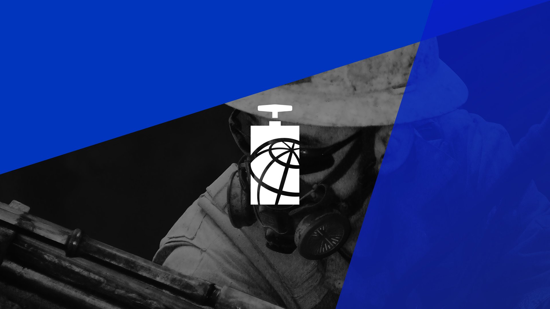
ISEE Logo Design
In 2017, the International Society of Explosives Engineers, or ISEE, contacted Insomniac Studios to revise its logo. Several technical issues plagued the logo, chief amongst which were the lack of a scalable vector file format, a hand-drawn original logo and costly difficulties reproducing the logo in various media.
The logo design project took almost two years to complete. It included more than 100 logo concepts, ISEE member and board of directors surveys and board consensus. In the end, Insomniac Studios delivered to the International Society of Explosives Engineers a whopping 696 files organized in 146 folders totaling 1.95 gigabytes.
These are the people who can drop a ten-story building within inches of its own footprint.
The mountain of logo work included RGB, CMYK, Pantone coated, Pantone uncoated, and black and white color formats in vector and high and low resolution raster files. It also included a second logo for use in small reproductions, die cast metal or embroidery.
The new logo was presented at the organization's 45 Annual Conference on Explosives and Blasting Techniques in Nashville, Tennessee, in January 2019.

ISEE Overview
The International Society of Explosives Engineers is the world's largest professional association for explosives engineers. Its mission is to advance the art and science of explosives engineering. Since 1974, ISEE has grown to include more than 4,000 members in 45 chapters in 90 countries. The organization focuses on explosives training, security, safety and education. Its members come from myriad industries. If you have been to a fireworks show, seen pyrotechnics at a concert or sporting event, live near a quarry or watched a building implode, chances are you've witnessed an ISEE member at work.
Previous ISEE Logo Review
ISEE's previous logo is a digital adaptation of the organization's first logo. It has not been updated since it was hand-drawn at the organization's inception more than forty years ago.
Exactly what comes to mind when you think of Wile E. Coyote and TNT.
The previous ISEE logo comprises a wood plunger box and the words International Society of Explosives Engineers. A plunger box, or blasting machine or shot exploder, is a portable device used to create an electrical charge to safely and reliably fire a blasting cap, which, in turn, triggers a larger blasting charge. Essentially, it looks like a tall, rectangular box with a post and handle extending from its top. Largely forgone in favor of modern digital devices, the plunger box is, in essence, exactly what comes to mind when you think of Wile E. Coyote and TNT.
The plunger box is depicted in almost 50/50 perspective; its left and right sides are roughly equally visible. However, the previous ISEE logo suffered from several perspective issues. First, the three vertical lines defining the left, center and right edges of the box are neither straight nor square. Second, each of the four vanishing horizontal lines comprising the plunger box's top and bottom are each at different angles from one another. For the box to appear in perspective, the top and bottom lines of the left side need to be at equal, but inverse angles to each other. This allows the two lines converge at the same point on the horizon. The same is true of the right side, however, the angle of these two lines may be at different angle of those on the left, provided they are also the inverse of each other. Third, the plunger box's handle is not parallel to the top of the plunger box. To be in perspective, the handle should run parallel, or at a slightly steeper angle to the plunger box's top. Fourth, smooth, round shapes are sharp and blocky. This is seen in the box's handle, plunger and wood grain.
A What the Font search of the logo's typeface yielded no exact matches, despite the typeface's distinctive lower case i, y, g, a and c letters.
Logo Project Brief
ISEE approached Insomniac Studios to design a new logo. The organization sought to modernize its logo and remedy reproduction issues. The previous ISEE logo was a digital version of a logo hand-drawn in the 1970s. Because of this, the previous logo exists only in raster file formats. There are no vector files to scale up the logo or send to printers. The logo's unorthodox angles, uneven edges and fine wood grain meant expensive set-up fees and modifications. Keeping the current logo was literally costing the organization money.
ISEE decided the organization would retain the plunger box as its core mark. The previous plunger box’s wood grain was to be removed and its symmetry, perspective and reproduction issues addressed.
Consideration was paid to the company’s forty-one-character name and four-letter initials. To accommodate the lengthy name, the revised logo was not to be excessively wide. ISEE requested four typographical variations for each logo design strategy. They included the company name running horizontally, the company name stacked vertically, the company name in conjunction with the company’s initials and, finally, the company’s initials.
It was also important to the organization that the new logo address clarity and legibility issues in the previous mark. The new logo needed to be easily and cost-effectively reproduced in a variety of media, including, but not limited to: online, one-color and four color print, embroidery, dye sublimation, cast metal, enamel and silk screening.
Consideration was also given to future design projects. ISEE uses a second logo for its education foundation. It also has a seal, which functions as a third logo. The organization plans to replace the foundation logo and seal with logos visually consistent with Insomniac Studios' new logo. By repeating typefaces, design elements and color, ISEE will develop brand recognition and equity from its formerly disparate properties.
Logo Design Approach
ISEE decided to approach the logo with Insomniac Studios using three distinct design strategies. Each design strategy would define the degree of latitude Insomniac Studios was to take when designing the new logo. This would, ISEE believed, produce a clear winner and guarantee consensus from its board of directors and members.
The first logo design strategy was informally known as 'the safe bet.' This design approach yeilded a revised version of the previous ISEE logo. The plunger box retained its 50/50 perspective, the wood grain removed and the overall logo style made more contemporary. Essentially, this version was to be recognizable to members as an updated version of the ISEE logo.
The second logo design strategy retained the plunger box mark and explored international and people motifs; elements ISEE saw as critical to its organization's identity. This design strategy provided the latitude to push the conventional pictographic plunger box design toward the modern and symbolic.
The third logo design strategy was informally referred to as 'anything goes.' It served as a catchall for outside-the-box, avant-garde ideas and logo concepts. Logos in the third group moved the logo project outside its comfort zone. Although the final logo was ultimately not chosen from this approach, Insomniac Studios is grateful for opportunity to explore and present several logos in this category.
Logo Design Process
Interpreting a company, its mission and culture as a symbol is its own challenge. Redesigning a symbol with more than forty years of familiarity, loyalty and brand equity is another challenge. Each logo project presents its own set of technical challenges, personal biases and industry vocabulary. These esoteric and idiosyncratic nuances influence logo design and shape and reshape logo revisions.
If an explosives professional uses that color, there's a cloud of something terrible headed your way.
For example, an early logo concept used a yellow-orange color as a vibrant alternative to corporate blue. The color was design appropriate and would help to distinguish ISEE from its competitors. There was, however, a hitch. Yellow, it turned out, was not an appropriate color for the explosives engineering community. Amongst explosives professionals, yellow signifies poisonous gas. If an explosives professional uses that color, there's a cloud of something terrible headed your way.
During the project, Insomniac Studios presented several concepts which included a starburst or explosion shape. After all, the client is a organization of explosives professionals. What could be more appropriate? Overlay the word BANG! and the work is done.
Only it isn't. The starburst shape, while easily identifiable as an explosion to the lay person, is, in the visual language of explosives professionals, a clear indication something has gone horribly wrong. To an explosives professional, the starburst shape indicates an uncontrolled explosion. To use this shape in the ISEE logo would be akin to advertising the organization as a cohort of reckless ne'er-do-wells.
These are the people who can drop a ten-story building within inches of its own footprint. There is nothing reckless about them or what they do. They are precise and they are careful. ISEE required a logo that spoke to both its members and the public, yet was mindful of the lexicon of symbols and colors used by explosives professionals.
Logo Design
The final logo design combined the previous logo's plunger box mark with a globe, representing the organization's international scope. The new mark recalls the previous logo, establishes the organization as a worldwide operator and provides the organization with myriad file formats to continue its branding initiatives.
The globe's axis runs from the plunger box's center to its upper right corner, the reciprocal angle of which establishes the distance the logo's text is offset from the logo mark.
The final ISEE logo includes four versions, each with an alternate wordmark. The versions include the organization full name laid out horizontally, stacked, as initials and as the full organization name with its initials. Each of these logos appear in black or blue on a white background as well as reversed out.
Alternate Logo
Insomniac Studios also provided ISEE with an alternate version of the logo. To ensure the logo displays correctly in small formats or in die cast metal or embroidery, the topmost longitude line terminates at the globe's north pole. This fuses together the two wedges on the right side of the arctic circle into one larger shape. The larger shape prevents ink from pooling, eliminates fine embroidery issues and simplifies die cast metal and enamel applications without impacting the logo's legibility or dramatically altering the mark.
Marketing Materials
Marketing Case Studies
Insomniac Studios logo design, branding and marketing case studies are an in-depth analysis of a project or concept. Some marketing case studies are the result of a client relationship. Others explore solutions to hypothetical projects. Not all marketing case studies represent a contract or partnership with the entity presented. The logo design, branding, marketing, graphic design, advertising, strategies, concepts and analysis presented are the copyrighted and intellectual property of Insomniac Studios and its clients.
Contact Insomniac Studios
If you like the thinking behind this branding, logo design and marketing project and would like to put it to work for your company or organization, contact Insomniac Studios.


