Dante’s Restaurant Logo Design
Established in 1984, Dante's never managed to cement itself as the live music cornerstone it hoped it would become. It did, however, earn a cult following among locals for its dry-aged steak and smoked meats.
Thirty-five years later, and faced with the inevitable cost to renovate, Dante's owners decided to sell the venerable steak restaurant. The new owners, a consortium of investors with a portfolio of restaurants and entertainment venues across North America, purchased Dante's in 2018.
The new owners planned to modernize the restaurant's interior and exterior and rebrand it as Dante's Smokehouse, an upscale and fine dining steakhouse while preserving the tradition of dry-aging steaks and smoking meats on the premises.

Logo Design Brief
The project brief for the new Dante's Smokehouse logo design required the logo to embody three core ideas: One, the new logo would update and modernize the restaurant's brand identity and give it a more formal cache. Two, the new logo would appeal to and attract travelers and out-of-town visitors. And three, the new logo design would position Dante's Smokehouse as a premier steakhouse in the competitive steak restaurant industry. The new logo did not have to include any of the elements from the previous Dante's logo.
Logo Review
The previous Dante's logo was a product of its time. The restaurant's logo had not been updated since its inception in the mid-1980s and it had long since shown its age. What virtues the original logo possessed--a (relatively speaking for the 1980s) limited color palate, easy legibility and good contrast--were overshadowed by its dated typeface, strange use of geometry and abundance of unnecessary copy. The original logo survived in handful of low-resolution raster formats; having been saved, resized, sharpened, scanned and saved again and again during the last three decades.
Logo Design
Insomniac Studios approached the new logo design as a fresh start for the beleaguered steakhouse. To position Dante's Smokehouse as competitor in the high-end steak restaurant industry, the logo and subsequent marketing materials needed a formal, but approachable design. The new logo design borrowed from gently from the beef industry, the history of cattle ranching and imagery from contemporary cooking.
The logo and subsequent marketing materials needed a formal, but approachable design.
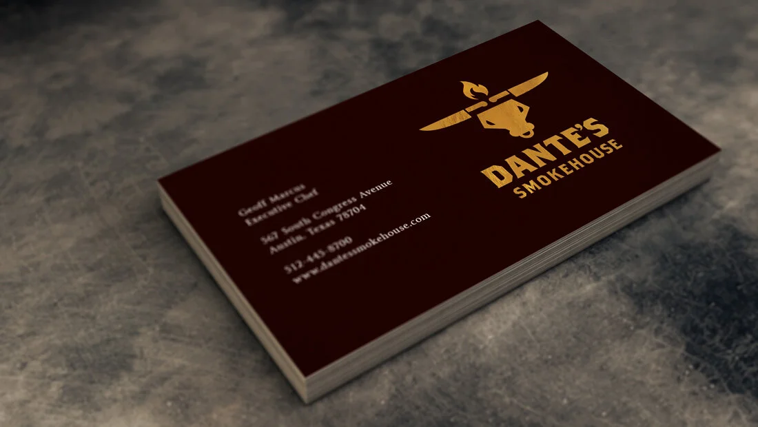
A handful of considerations go into making a great steak: the beef, the cut and how it is cooked. Insomniac Studios considered each of these elements to design the new logo. The beef is represented by the cattle head. The cattle’s breed, be it is Black Angus, Red Angus, Charolais, Hereford, Limousin, or Holstein and its diet will contribute to the quality and flavor of a steak. The steak’s cut: filet, porterhouse, bone-in ribeye, t-bone or sirloin; dramatically influences flavor and texture. Two chef’s knives replace the cattle’s horns in the logo to represent the importance of the steak’s cut. And, lastly, fire. The fire was the only graphic design element from Dante’s previous logo to remain. It represents the careful application of smoke and heat in the steak’s cooking.
Navigate: Logo Design | Alternate Logos | Brand Identity
Marketing Case Studies
Insomniac Studios logo design, branding and marketing case studies are an in-depth analysis of a project or concept. Some marketing case studies are the result of a client relationship. Others explore solutions to hypothetical projects. Not all marketing case studies represent a contract or partnership with the entity presented. The logo design, branding, marketing, graphic design, advertising, strategies, concepts and analysis presented are the copyrighted and intellectual property of Insomniac Studios and its clients.
Contact Insomniac Studios
If you like the thinking behind this branding, logo design and marketing project and would like to put it to work for your company or organization, contact Insomniac Studios.


