Cleveland Guardians Logo Review
Note: What follows is an opinion piece on the strengths and weaknesses of new Cleveland Guardians logos and branding. The Cleveland Guardians logos were designed by the Cleveland Guardians’ in-house marketing and graphic design team. Insomniac Studios did not design the new logos.
The Cleveland Indians name has been in use since 1915. After moving from Michigan in 1900, the first Cleveland team was called the Cleveland Lakeshores, then, a year later, the Bluebirds. In 1901, after leaving the minor American League for the new Major League, the name was shortened to the Blues, but changed a year later to the Bronchos. From 1903 to 1914 the team was called the Napoleons, which was shortened to Naps, before changing to the Cleveland Indians in 1915.
Name changes are nothing new to this Cleveland team. On July 23, 2021, the Cleveland Indians formally announced next year the team will change its name to the Cleveland Guardians. The Cleveland Guardians will be the team’s fifth Major League name and seventh name since 1900.
This is a welcome and long-overdue change. The Indians name has been an issue of contention for decades. In 2019, the team took a step in the right direction when it ceased use of the offensive Chief Wahoo mascot.
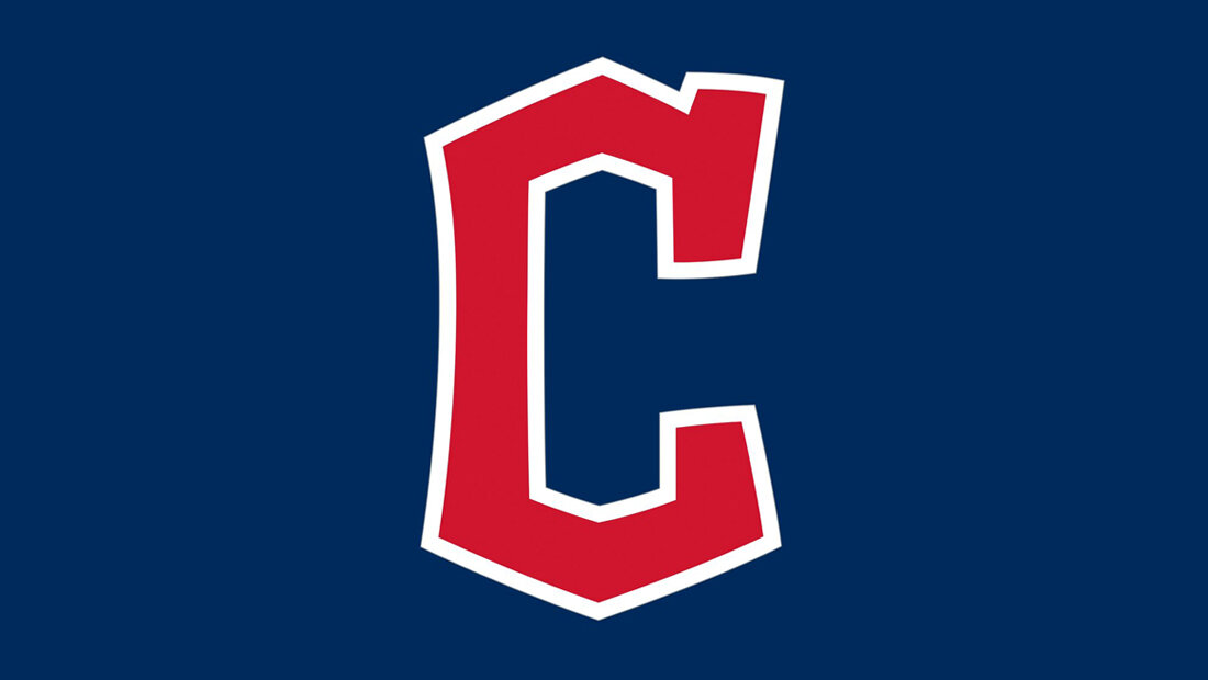
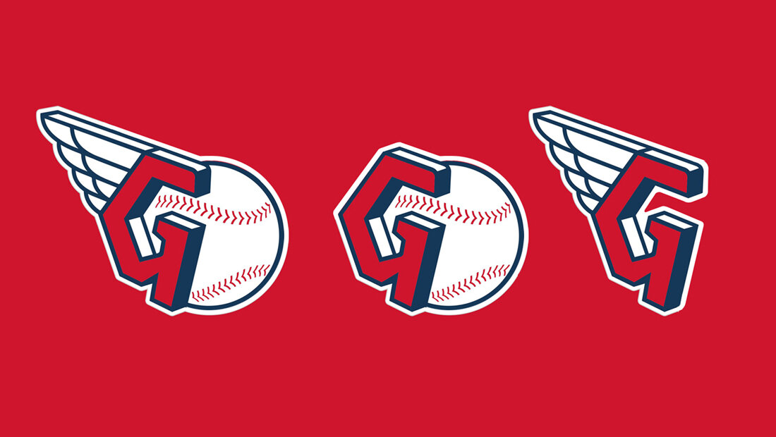
When the new name was announced, the team presented three new Cleveland Guardians logos: a script logotype with a flag underscore, the Fastball G logo and the Diamond C logo. Management also shared a new typeface for team uniforms.

Cleveland Guardians of Traffic
First, a word on the origin of the Cleveland Guardians name. Just outside Progressive Field, where the team has played since 1994, is the 5,865-foot-long Hope Memorial Bridge. It spans the Cuyahoga River and connects Cleveland’s east and west sides. The bridge, completed in 1932 and renovated and renamed in 1983, was originally called the Lorain-Carnegie Bridge for the two streets it connected.
Because of their similarity to the old logos, the Cleveland Guardians logos are haunted by the ghosts of protests past. There is too much history; too much nostalgia carried over from the Cleveland Indians logos to the new Guardians logos.
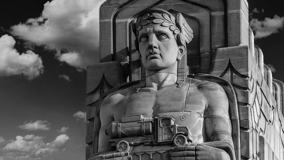
At each end of the nearly mile-long bridge, four massive pylons tower above the roadway. The pylons each support two stone figures holding a different form of 1930s transportation. These beautiful Art Deco statues are the Guardians of Traffic. It is for these statues the baseball team is named.
When the team moved from Cleveland Municipal Stadium on Lake Erie to Progressive Field (at the time, Jacob’s Field) in 1994, the new stadium offered a view north to the Cleveland skyline. While the view north remains the same, The new Guardians name pulls the Hope Memorial Bridge, the Guardians of Traffic statues, the Cuyahoga River, Ohio City and, ostensibly, Cleveland’s south and west suburbs into the fold. The new name, somehow, now makes more of the city, not just the downtown skyline, feel like is part of this Major League Baseball team.
Cleveland Guardians Logos
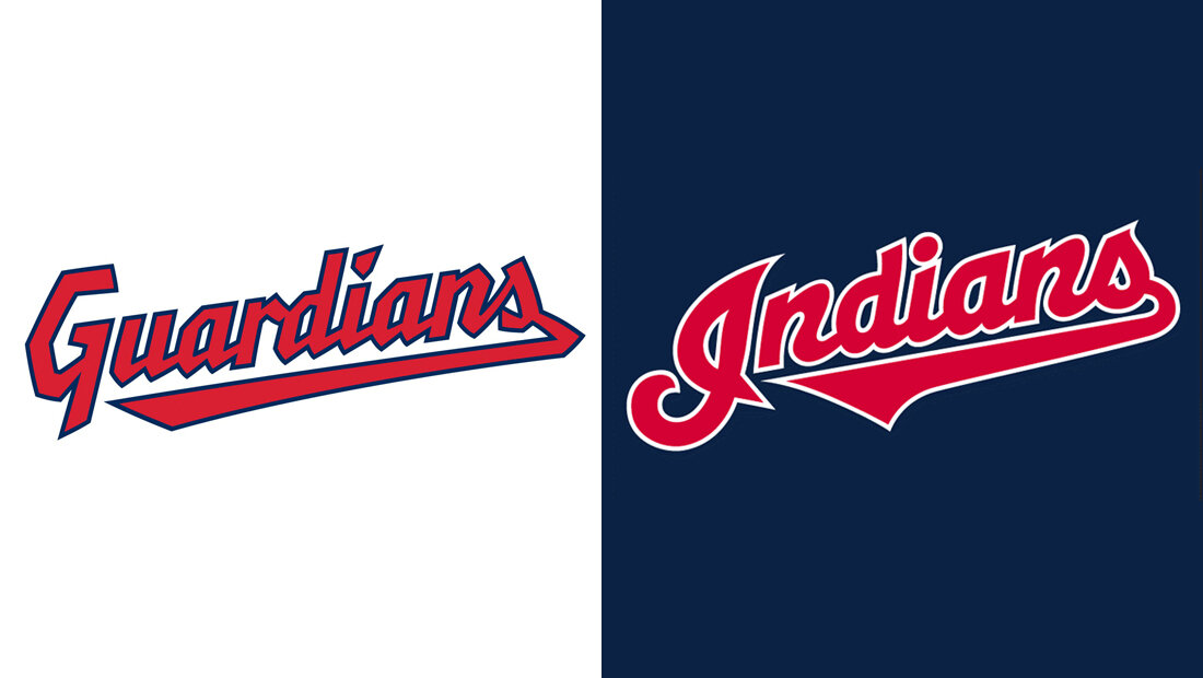
The new Cleveland Guardians logos look too much like the former Cleveland Indians logos. This might be acceptable in another rebranding situation, but in the case of the Cleveland Guardians, the entire point was to distance the team from the racially insensitive Indians name. The design team should have done more to separate the Guardians logo designs from the former brand identity. When the team parted ways with the Indians name it should have parted ways with all aspects of the visual brand identity, as well. Nothing should remain to connect the Guardians to the Indians. Because of their similarity to the old logos, the Cleveland Guardians logos are haunted by the ghosts of protests past. There is too much history; too much nostalgia carried over from the Cleveland Indians logos to the new Guardians logos.
The logo designer team should have looked anywhere other than to the Cleveland Indians logos for inspiration. The new logos should have represented a fresh start and they don’t.
The logo design team should have looked more closely to the Guardians of Traffic for inspiration. They should have looked to Cleveland’s history. To transportation. To industry. To other Major League Baseball teams. To the Great Lakes. To the Cuyahoga River. Heck, to the Cuyahoga River catching fire. The logo design team should have looked anywhere other than to the Cleveland Indians logos for inspiration. The new logos should have represented a fresh start and they don’t. What was intended to be a sincere rebranding and a progressive attempt to right and old wrong feels instead like a disingenuous public relations stunt.
What was intended to be a sincere rebranding and a progressive attempt to right and old wrong feels instead like a disingenuous public relations stunt.
Script Guardians Logo
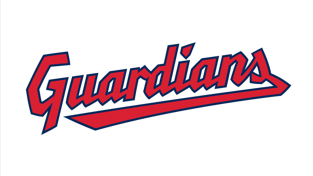
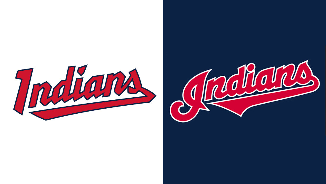
The script Cleveland Guardians logo is an angular re-imagining of the script Cleveland Indians logo. The new logo is so similar to its predecessor that it feels more like an homage or tribute than a new identity. Both logos incline from left to right and include a flag underscore which emanates from the last letter and folds back under the logotype. The new logo’s only unique quality is its crude, sharp letterforms.
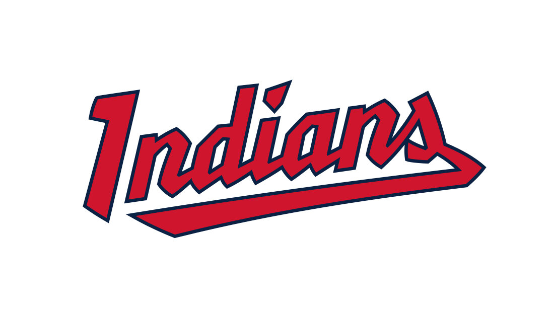
The angular Guardians typeface looks regressive, not progressive. It is a step backward, not forward. Redrawing the script Cleveland Indians logo in the Guardians typeface makes the issue more apparent. The mockup script Cleveland Indians logo below would look right at home in the team’s logo history. If a caption beneath it read: “Cleveland Indians logo 1994-2002,” it would not look out of place.
The angular Guardians typeface looks regressive, not progressive. It is a step backward, not forward.
The argument against the crude, angular letterforms is evident when viewed alongside the team’s official 1973 - 1978 logo, which appears below. The new script Guardians logo seems to have taken some inspiration, sadly, from this logo. By using this style of typeface, the logo design team, intentionally or unintentionally, dragged Chief Wahoo back into the brand identity, if only in spirit. The letters in the two teams’ names may be different, but they spell out the same message.
Perhaps Cleveland Guardians management didn’t want to rock the boat. Perhaps the consensus was to design new logos similar to the Cleveland Indians logos so the renamed team felt familiar. Whatever the reason, the Cleveland Guardians’ new brand identity suffers for it. The effort put into the name change feels wasted. It was the time to be bold and instead it is a missed opportunity.
Proposed Guardians Logo Design
Below is a concept Insomniac Studios developed as an alternative to the Cleveland Guardians logo design. The heavy type is bolder and better suited to represent a team named for massive stone statues. The typography style is closer to the Art Deco style of the Guardians of Traffic, yet modern enough that it doesn’t feel dated or inappropriate for a Major League Baseball team. The slight arc at the bottom of the Guardians logotype is reminiscent of Hope Memorial Bridge; home of the Guardians of Traffic. Most importantly, the proposed logo design has no graphic connection to the previous Cleveland Indians logos and, therefore, no connection to the racially insensitive name. No parallels can be drawn between this logo and the old ones. It is a fresh start; free of the past and the protests. The proposed logo design better represents the new team name, the city, and the fans.
Cleveland Guardians C Logo
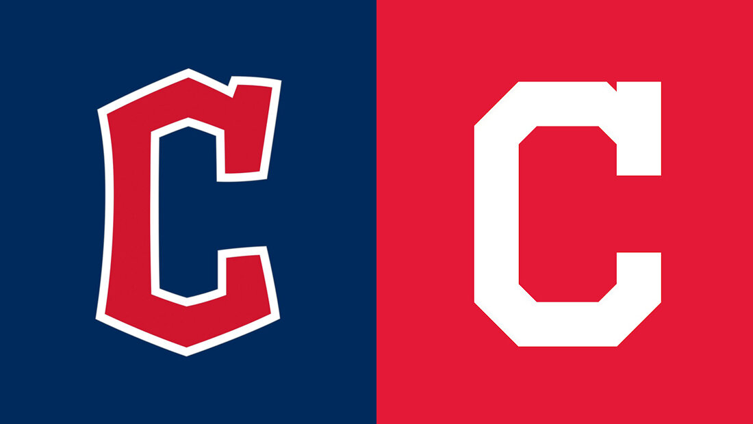
The new Diamond C logo replaces the Cleveland Indians Block C logo. The simple Block C logo is used during televised games as well as on uniforms and in small applications. Having a similar, small replacement makes sense. Everywhere the Block C was used can easily display the new Cleveland Guardians Diamond C logo.
The new Cleveland Guardians C logo inherited the Cleveland Indians Block C serif on the letter’s upper terminal. The new C logo was designed using the Guardians of Traffic as inspiration. The following is a quote from the team’s website: “The new font represents the unique characteristics of Cleveland with angular letters and numbers that mimic the architecture of the bridge and the Guardians of Traffic.” The quoted text appears next to an image of one of the Guardians of Traffic statues with Progressive Field in the background. The statue is washed out, but diamond-like shapes on the pylon behind it are in color. If this angular Art Deco pattern is meant to be the inspiration for the C logo and typeface, why give the letters soft, rounded edges? This design choice is inconsistent with the statues, the Art Deco style and the team’s statement.
Cleveland Guardians Fastball Logo
Unnecessarily clunky, intentionally clumsy and borderline offensive, the new Cleveland Guardians Fastball logo is in need of revision or, frankly, replacement.
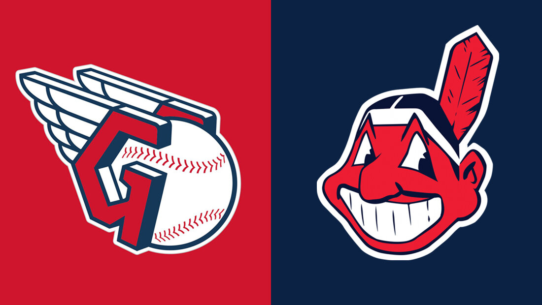
The most shocking and striking aspect of the Cleveland Guardians logos, and this logo in particular, is how many design choices say ‘Native American.’ It is staggering to think after deciding to change the team’s name that the design team or within Cleveland Guardians management would consider or even condone a logo design that is, essentially, wearing a feather headdress. If the team didn’t want to change its name, it shouldn’t have. To change the team’s name only to design logos that use Native American visual elements is a shame.
To change the team’s name only to design logos that use Native American visual elements is a shame.
Yes, the Guardians of Traffic statues are depicted wearing winged headdresses. And, yet, the statues are unmistakably not Native American. This is where the nuance of style become critical. If the team wanted to use a winged G, it should have made every effort to do so in the Art Deco style of the statues and stay as far away as possible from anything that looked even slightly Native American. The Fastball logo is not stylized enough to escape the gravity of Chief Wahoo and the Cleveland Indians name.
Side-by-side with its predecessor, the new logo looks as if it was designed to be called Chief Fastball.
On its own, the Fastball logo is not insensitive or offensive. Viewed through the lens of the decades-long debate over the Cleveland Indians name and Chief Wahoo, more consideration should have been paid to the design choices. Side-by-side with its predecessor, the new logo looks as if it was designed to be called Chief Fastball.
The Cleveland Guardians Fastball logo comprises a pair of winged Gs sandwiching a baseball. The winged Gs are too close together to accommodate a sphere the size of the baseball. The two winged Gs should appear farther apart if the baseball is meant to be seen as a sphere. In its current configuration, given the distance between the winged Gs, the baseball would be a squashed ellipse approximating the shape of a donut or tire rather than a round baseball.
The entire logo is drawn with a single weight line. The line outlining the wings is the same width as the line outlining the letter G which is the same width as the line around the baseball. All of this is good, consistent line work. Until the baseball’s stitching. Here, the bold line work is suddenly replaced with a line weight about a third as heavy as the rest of the logo.
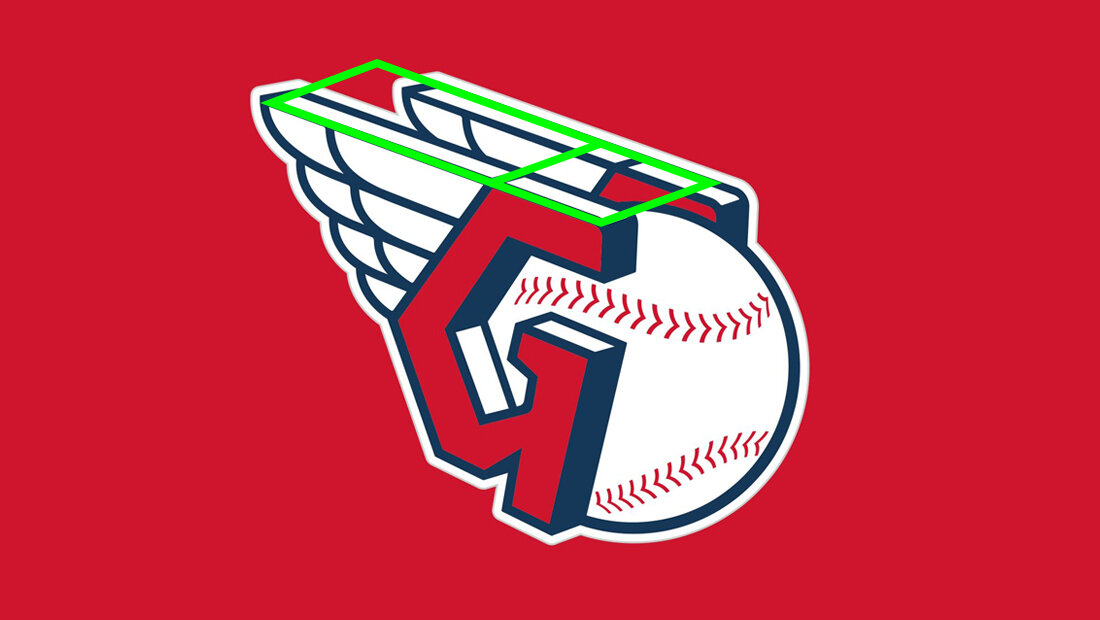
In the image below, a green rectangle highlights several perspective issues in the logo’s wings. This grid also demonstrates that the background winged G is smaller and farther forward than the foreground winged G. It is reasonable that this was done to condense the logo and reduce negative space and the logo’s overall height. Both of these are worthy pursuits, but do so at the expense of logo’s overall quality.
One suggestion for improvement might be to eliminate one of the logo’s design elements. The logo design could be simplified to a single winged G. Or the Gs could be removed in favor of a winged baseball. Or the wings could be omitted in favor of a G and a baseball.
Removing the background winged G makes the logo easier to read. It also makes the logo look less like it is wearing a Native American headdress.
There remains, however, something eerily familiar about the new Cleveland Guardians Fastball G logo. Somehow, it is just reminiscent enough to evoke memories of Paramount Picture’s Major League movie poster. The 1989 comedy tells the story of the Cleveland Indians when it was one of the worst teams in Major League Baseball. This is not the type of nostalgia the Cleveland Guardians head office should be trying to tap into.
Cleveland Guardians Typeface
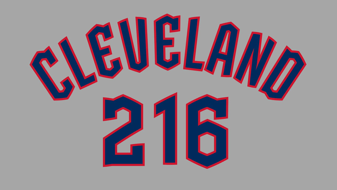
The new Cleveland Guardians Bridge Print typeface reportedly was designed with the Guardians of Traffic statues as its inspiration. Visually, the new typeface has more in common with soon-to-be-defunct Cleveland Indians brand than it does the Art Deco bridge statues. Angular and crude, the typeface befits the insulting Indians moniker and Chief Wahoo than the new Guardians brand identity.
The typeface is clumsy and busy, constantly tripping over its own angular jubilance.
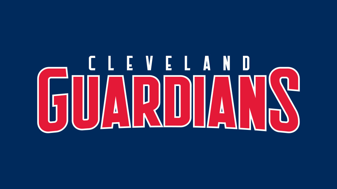
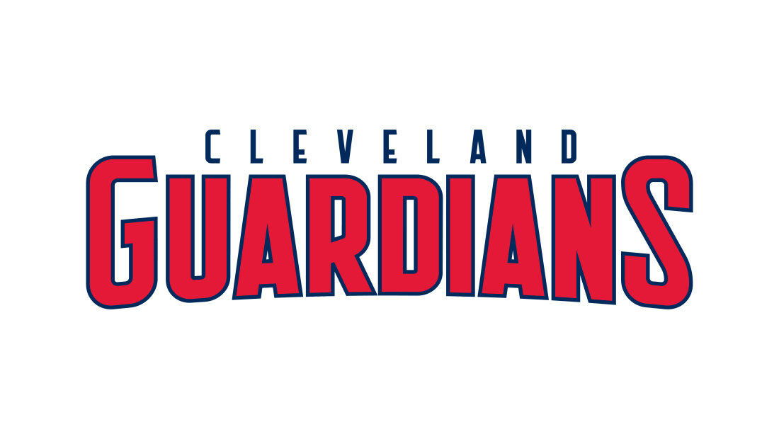
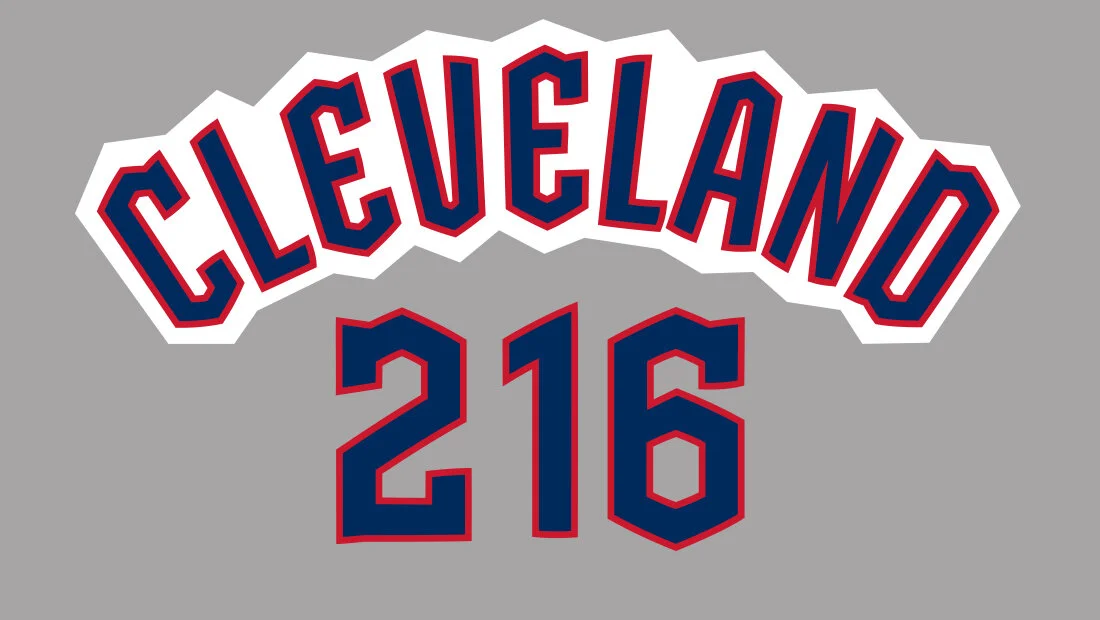
The new team is named for the eight massive figures that adorn the Hope Memorial Bridge. Nothing about this typeface evokes Art Deco (the style in which the figures are carved) or implies a sense of heaviness or weight. Or guardian, for that matter. The inconsistent use of serifs on the C, E and D make the typeface even less reliable. Below is the Cleveland Guardians logo typeface as issued by the team.
Sprawled in an arc, the typeface looks like an accordion’s bellows. Placing a large outline around the word Cleveland highlights the wobbly, unstable typeface. Only the letter L is given a flat surface on which the weight of the letter can rest. Every other letter in the Bridge Print typeface balances precariously on a point. The typeface is clumsy and busy, constantly tripping over its own angular jubilance.
Overlaying a grid on the Cleveland Guardians logo typeface shows inconsistencies in the height and letter placement. White circles highlight changes that would give the logotype a more stable or grounded look and keep the letters from appearing as if they are dancing.
A radial grid shows the issues with the letters as they fan across the arc. Each character’s uprights should run parallel to the grid. Instead, many letters are at angles independent of the radial grid. The first E, the second L, the N and the D are the logo’s biggest offenders. Underneath, none of the three numerals in 216 share a common baseline.
Below, Insomniac Studios made several adjustments to the Cleveland Guardians logotype. The two Es, and the A, N and D have a new lower half that makes the letters look more stable and less jittery. The spaces between the letters, or kerning, is adjusted and the letters are rotated to follow the radial gridlines. At the bottom, the numbers share a common baseline. The notch on the 2 was removed and the height of the 6 was reduced.
Overall, the Cleveland Guardians logo typeface remains unique, but the design changes make it appear more solid and dependable, like the Guardians of Traffic statues for which the team is named.
Cleveland Script Logo
It is not hard to see there was some interest in relating the new Cleveland Guardians logo design to the existing script Cleveland logo. Destination Cleveland (the Convention and Visitors Bureau of Greater Cleveland, Inc.) developed the script Cleveland logotype in 2014 to promote the city.
Conclusion
Overall, the decision to rename the Cleveland Indians was long overdue. The Cleveland Guardians is a fine name for the franchise, although probably better suited for an NFL team than a Major League Baseball team.
The logo design process should have created a new brand identity for the Cleveland Guardians; separate and distinct from the Cleveland Indians.
The decision to copy and paste the current Cleveland Indians brand identity onto the Cleveland Guardians feels as if it was made out of fear of fan retribution or an attempt to maintain the status quo. Whatever the reason, the new Cleveland Guardians logo designs feel too connected to the team’s past and former offensive name. The new logos are unable to escape the gravity of the Cleveland Indians name. Because of this, the effort to change the team’s name feels wasted.
The logo design process should have created a new brand identity for the Cleveland Guardians; separate and distinct from the Cleveland Indians. It should have been a fresh start. It isn’t.
References
Major League Baseball Cleveland Guardians
About Hope Memorial Bridge
Letter from Cleveland Guardians Owner Paul Dolan
Sports Illustrated Name Change Article
Hope Memorial Bridge Guardians of Traffic
Destination Cleveland Script Logo
Cleveland Script Logo Locations
Progressive Field
Cleveland Indians
Paramount Pictures Major League
Cuyahoga River Fire
Marketing Case Studies
Insomniac Studios logo design, branding and marketing case studies are an in-depth analysis of a project or concept. Some marketing case studies are the result of a client relationship. Others explore solutions to hypothetical projects. Not all marketing case studies represent a contract or partnership with the entity presented. The logo design, branding, marketing, graphic design, advertising, strategies, concepts and analysis presented are the copyrighted and intellectual property of Insomniac Studios and its clients.
Contact Insomniac Studios
If you like the thinking behind this branding, logo design and marketing project and would like to put it to work for your company or organization, contact Insomniac Studios.

