The home of rock ‘n’ roll just got a little rowdier. The Mayhem Brewing Company is a start-up brewery with plans to open* in Cleveland’s historic waterfront warehouse district. The Mayhem Brewing Company logo design and aesthetic pays tribute to both Cleveland’s brewing and rock ‘n’ roll heritage.
Cleveland was founded in 1796 where the wandering Cuyahoga River meets Lake Erie. When the city’s first directory was published in 1837, Cleveland already had two breweries. By 1910, 26 breweries brewed beer in the city. This included venerable brewing names like Pabst, Pilsener, Schlitz and Stroh. After the Great Depression and the subsequent collapse of the luxury car market, the Peerless Motor Company converted its Cleveland factory to brew beer under the name Carling Brewing Company, following an agreement with the Brewing Corp. of Canada.
Today Cleveland is home to 33 breweries. It’s success as a beer city is owed, in no small part, to the role the Great Lakes Brewing Company played in the burgeoning craft beer scene when it started brewing beer in 1988. Other notable present-day Cleveland breweries include Fat Head’s Brewery, Market Garden Brewing, Hofbrauhaus Cleveland and Thirsty Dog Brewing Company (an Akron brewery with a second Cleveland location).
The term “rock ‘n’ roll,” as the story goes, was coined in 1951 on Cleveland airwaves by WJW-AM disc jockey Alan Freed, host of the now infamous Moondog Rock & Roll House Party. It was on his show Freed allegedly coined the phrase “rock ‘n’ roll” (or shared it with a wider audience) and the name stuck. Throughout the early 1950s, Freed’s show provided a platform for the rebellious new music style.
Cleveland’s reputation as a music city grew. Bands and record labels from around the world took notice. Bands that had difficulty getting shows in other parts of the country, could count on Cleveland venues and audiences. The success of legendary acts like Rush, David Bowie, Meat Loaf and Bruce Springsteen can be traced back to Cleveland concert venues, record labels and radio stations. Because of Cleveland’s influence in the legacy of rock ‘n’ roll, the city was selected to host the Rock ‘N’ Roll Hall of Fame, which opened in 1995.
* Editor’s Note: The COVID-19 pandemic has dramatically delayed and altered these plans.
Logo Design Brief
The Mayhem Brewing Company required a new brand identity designed from the ground up. The project scope included the main brewery logo and a logo system of secondary logos to augment the brand. The brewery also required promotional marketing and advertising collateral as well as brewery merchandise that reinforced the brewery’s identity.
The project scope included the main brewery logo and a logo system of secondary logos to augment the brand.
The brewery logo design and supporting marketing materials needed to have a rock ‘n’ roll edge. It was important that the Mayhem Brewing Company look hard rock, heavy metal or punk rock, but not become a pastiche of rock’s history or echo a particular band’s style.
Brewery Logo Design
Sometimes, what you are not defines what you are. Such was the case with the Mayhem Brewing Company logo design. From the early stages of the logo design project, it was clear that mayhem would not mean utter chaos. Rather, the brewery logo design would imply a controlled chaos, as if to say that the brewing process was reigned in and allowed to go crazy only when permitted. The Mayhem Brewing Company logos and marketing materials were to be clean and sharp, but retain a certain rock ‘n’ roll edge.
From the start of the brewery logo design process, it was apparent the Mayhem Brewing Company logo and its supporting materials would have a bold and assertive color palette. Almost straightaway, red, black and white were the clear choice for the brewery logo. This color-first approach was unusual for Insomniac Studios. Color is seldom the first design attribute to be decided upon and it is rarely the factor that defines later design decisions. Typically, in the early planning and design stages, a logo shape, style, or concept or even a marketing message comes first. The Mayhem Brewing Company project was different from the get-go.
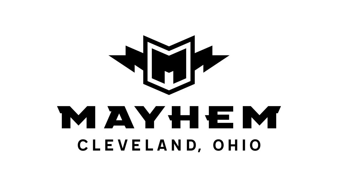
Strong and distinct, the Mayhem Brewing Company lightning M logo stood out as the clear choice for the brewery.
The lighting motif appeared very early in the Mayhem Brewing Company logo design process. Insomniac Studios trialed dozens and even hundreds of logo sketches. The project very nearly took an entirely different approach had the lighting M concept not appeared. Strong and distinct, the Mayhem Brewing Company lightning M logo stood out as the clear choice for the brewery.
The next step was to develop the brewery logo typography. After countless tries, no one typeface stood out as a match for the logo design. Insomniac Studios elected instead to heavily modify an existing typeface which had ticked many, but not all, of the logo requirement boxes. Made heavier and wider, the typeface then received its signature chiseled slab serifs.
To reflect the Mayhem Brewing Company lighting M’s symmetry, a slab serif was added to the right side of the second M in Mayhem. This evenly balanced the logotype under the logomark and complimented the logo’s left- and right-facing lightning bolts.
The lighting M logo evokes the rock ‘n’ roll and heavy metal bands of the 1970s and 80s, but its simple, flat design makes it feel contemporary and new. With a few nostalgic flourishes, it would be easy to imagine the Mayhem Brewing Company logo scrawled on lockers and sewn on denim jackets 45 years ago.
It would be easy to imagine the Mayhem Brewing Company logo scrawled on lockers and sewn on denim jackets 45 years ago.
With the style and tone of the Mayhem Brewing Company logo design established, the designs for the logo system’s secondary marks quickly fell into place. Among them, the anarchy A symbol was retooled as an M for Mayhem. This logo lead the way for the brewery’s early marketing and promotional advertising. Not to appear without the main Mayhem Brewing Company logo, the anarchy M was made to look like spray paint graffiti. This positioned the Mayhem Brewing Company as something new, edgy, mysterious and a little dangerous (which it isn’t—its perfectly safe, but, hey, rock ‘n’ roll).
Mayhem Brewery Logo
Secondary Logos and Brewery Logo System
Navigate: Brewery Logo | Beer Can Design | Brewery Marketing | Brewery Advertising | Brewery Logo T-Shirts | Brewery Logo Hats | Brewery Logo Hoodies | Top
Beer Can Design
Brewery Marketing Collateral
Brewery Advertising
Promotional marketing advertising poster brewery logo Mayhem Brewing Co by Insomniac Studios.
Navigate: Brewery Logo | Brewery Logo System | Beer Can Design | Brewery Marketing | Brewery Logo T-Shirts | Brewery Logo Hats | Brewery Logo Hoodies | Top
Brewery Logo T-Shirts
Navigate: Brewery Logo | Brewery Logo System | Beer Can Design | Brewery Marketing | Brewery Advertising | Brewery Logo Hats | Brewery Logo Hoodies | Top
Brewery Logo Hats
Brewery Logo Hoodies
Navigate: Brewery Logo | Brewery Logo System | Beer Can Design | Brewery Marketing | Brewery Advertising | Brewery Logo T-Shirts | Brewery Logo Hats | Top
References
History of Brewing in Cleveland
Rock ‘N’ Roll Hall of Fame
Birth and Rise of Rock 'N' Roll in Cleveland
Great Lakes Brewing Company
Contact Insomniac Studios
If you like the thinking behind this branding, logo design and marketing project and would like to put it to work for your company or organization, contact Insomniac Studios.
Marketing Case Studies
Insomniac Studios logo design, branding and marketing case studies are an in-depth analysis of a project or concept. Some marketing case studies are the result of a client relationship. Others explore solutions to hypothetical projects. Not all marketing case studies represent a contract or partnership with the entity presented. The logo design, branding, marketing, graphic design, advertising, strategies, concepts and analysis presented are the copyrighted and intellectual property of Insomniac Studios and its clients.


